Last updated August 28, 2026
Thumbnail here: How to design a door hanger
With so many obsessing over clicks and impressions, smart marketers are rediscovering the power of print advertising. Eye-catching door hangers, when done right, can achieve impressive results. They’re local, immediate, and impossible to ignore. Think about it: no ad blockers, no spam filters, no scrolling past. Just your message, front and center, on your ideal customer’s front door.
In this guide, you’ll learn exactly how to design a door hanger marketing campaign that grabs attention, drives action, and delivers real ROI. We’ll break down everything from messaging and design to distribution strategies and tracking, so you can create a campaign that converts.
Why door hanger design matters more than ever
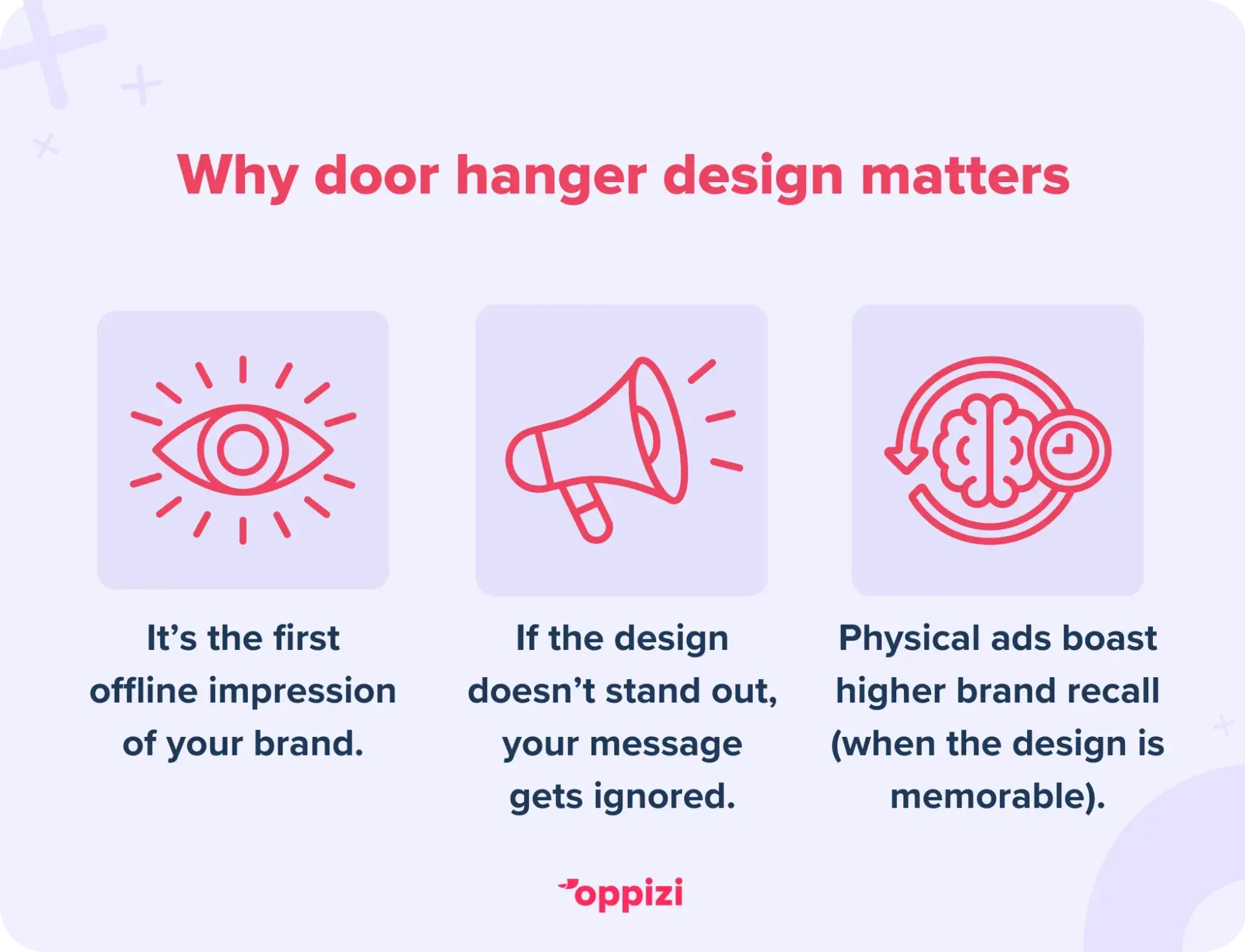
The tactile nature of door hangers means your design is your handshake - it’s the first impression and sometimes the only impression your brand will make offline.
- Due to their location, door hangers boast a high impression rate, so if your design is weak, your message falls flat every time.
- Physical advertisements boast a brand recall rate 70% higher than their digital counterparts, emphasizing the impact of truly memorable design.
The takeaway? Invest in strong design to maximize your door hanger’s impact.
1. Start with the right dimensions & shape
Standard door hanger sizes are usually 4.25” x 11” or 3.5” x 8.5”, which fit easily on most door handles. However, consider:
- Custom shapes like rounded edges, cutouts, or die-cuts can capture attention even more. For example, a pizza place might design a hanger shaped like a slice.
- Make sure your design works well within the size. Avoid crowded text or tiny fonts that disappear from a few feet away.
Balance creative flair with functionality - too unusual a shape might fall off the door or be overlooked.
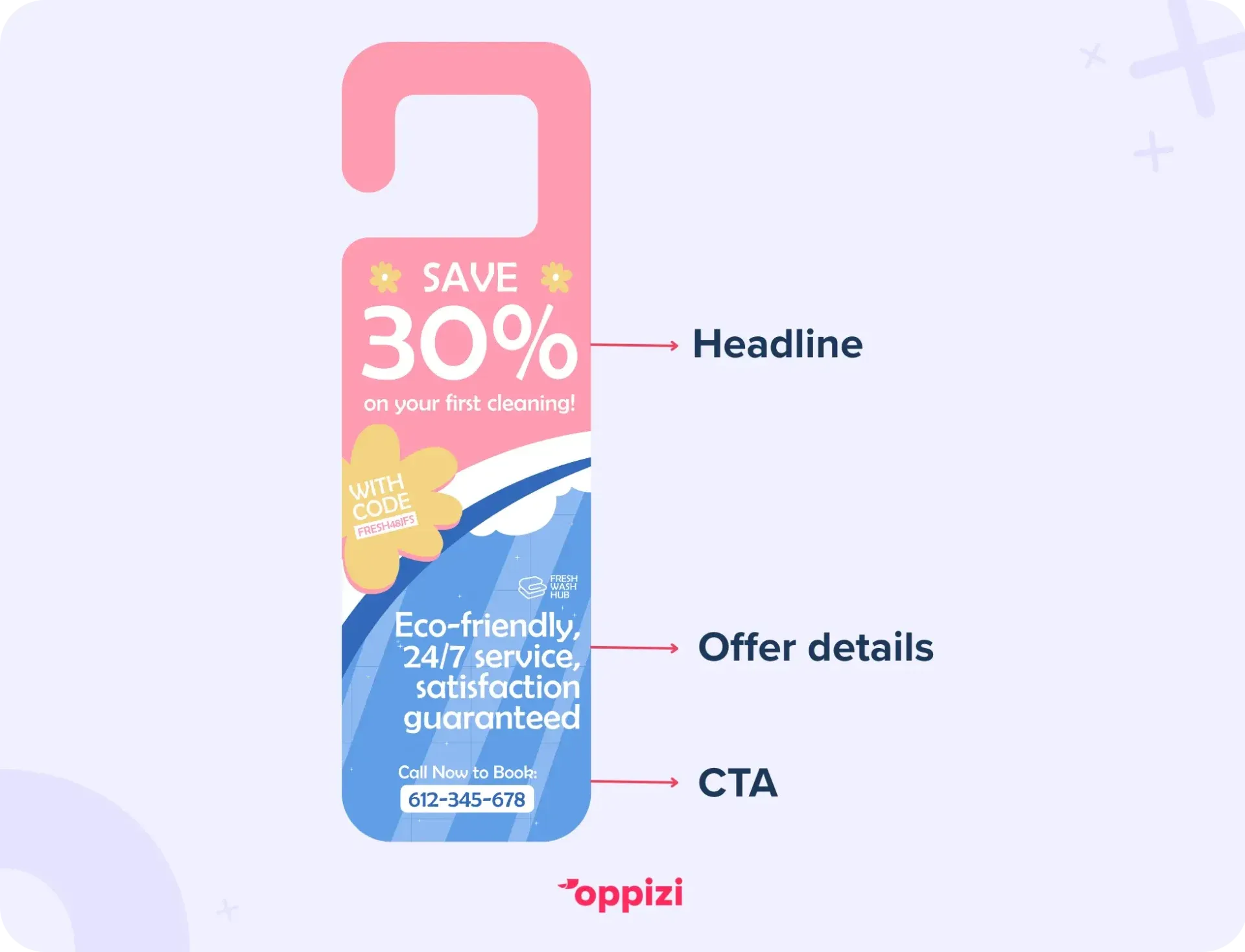
2. Use a clear visual hierarchy
Your door hanger needs to tell a story at a glance. Use design principles to guide the reader’s eye:
- Headline (largest font): This is your hook. Make it benefit-driven and bold.
- Supporting text: Smaller font that should focus on details like the offer or brand values.
- Call to action (CTA): This should stand out visually. Consider a contrasting button or bright color block.
For example:
Spacing between text is just as important. White space prevents overload and enhances readability.
3. Choose colors strategically
Color does more than make a door hanger look pretty. It conveys emotion, builds brand identity, and grabs attention:
- Use high contrast between the text and background for easy legibility (e.g., dark text on light background or vice versa).
- Incorporate brand colors consistently to build trust and recognition.
- Use an accent color (like the brightest colour in your brand kit) sparingly to highlight key elements such as your CTA or special offer.
- Avoid too many colors. Stick to 2-3 main tones for a clean, professional look.
Keep in mind cultural associations with colors in your target market. Green signals eco-friendliness in many countries, while blue conveys trust.
4. Select fonts for impact and readability
Typography is a critical design choice:
- Use no more than two fonts: one for headlines, one for body copy.
- Choose fonts that are legible from a distance and at small sizes.
- Avoid overly decorative or script fonts that sacrifice readability.
- Consider font weight and spacing to create emphasis.
A bold sans-serif font works well for headlines, paired with a clean serif or sans-serif for details.
5. Use high-quality, relevant imagery
Images instantly communicate tone and professionalism:
- Use real photos over generic stock images where possible (e.g., local landmarks, happy customers, products in action).
- Choose images that reflect your offer clearly - don’t confuse the viewer.
- Keep images uncluttered and ensure they don’t overpower your message.
- Consider using icons or illustrations for simplicity and style, especially if you want a clean, modern look.
Remember, images should support your message, not compete with it.

6. Craft concise, persuasive copy
While design demands attention, your copy drives action. Keep text brief but powerful:
- Focus on benefits, not just features.
- Use action words to create urgency: “Call now,” or “Book today.”
- Keep sentences short and avoid jargon.
- Use bullet points or icons for easy scanning.
Since space is limited, every word on your door hanger must count.
7. Incorporate effective calls to action (CTA)
The CTA is your conversion driver, so make it impossible to miss:
- Use contrasting colors or borders to set your CTA apart.
- Position it near the bottom or in an easy-to-find spot.
- Be specific and tell the reader exactly what they need to do: “Call to book your free consultation” beats “Contact us.”
- A sense of urgency can increase conversion rates by 332%. Use deadlines such as: “Offer ends June 30.”
Including a phone number, website URL, or QR code next to the CTA can boost response rates.
8. Design the back too
Many door hangers are double-sided, so use both sides strategically:
- Front: grab attention, deliver headline, and highlight offer.
- Back: provide additional info like testimonials, services list, or a small map.
Here's an example of how this might look:
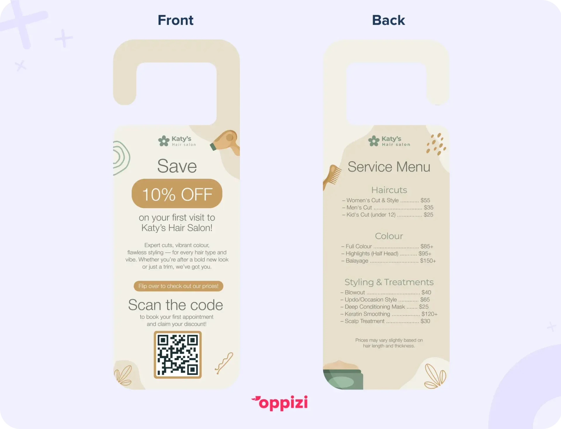
Ensure the back design complements the front without overwhelming the reader.
Bonus design tips
To ensure your door hanger makes an impact, here are some additional design tips you can consider:
- Texture & finish: Matte or gloss coatings can elevate your design and the durability of your door hanger.
- Special features: Adding perforations for coupons or tear-off tabs encourages engagement.
- Brand consistency: Align your door hanger with your website and social media visuals.

Final thoughts
Door hangers are more than just a piece of paper. They’re a powerful, physical way to make your message impossible to miss. With their high visibility, targeted reach, and strong ROI, they’re one of the most effective offline tools for local customer acquisition.
Whether you're promoting a grand opening, seasonal offer, or neighborhood service, a well-crafted door hanger can build brand recognition, spark action, and drive foot traffic straight to your door.
Need support in managing your campaign? At Oppizi, we help businesses like yours print and distribute door hangers that get real results. From strategy to execution, we handle the details, so you can focus on conversions.
Ready to take your marketing offline and put your brand in the right hands? Start your door hanger campaign with Oppizi today!
Frequently asked questions
- What font size is ideal for door hangers?
Headlines should be at least 24pt with the body copy at 12- 14pt to ensure readability from a short distance.
- Should I use photos or illustrations on my door hanger?
To build authenticity and trust, use real photos showcasing your business and the work you do. However, illustrations are a good idea for reflecting simplicity or branding consistency.
- How many colors should I use in my door hanger design?
Limit your palette to 2-3 colors to keep the design clean and focused. The colors should align with your branding.
- Can I use QR codes on door hangers?
Absolutely. QR codes make your door hanger more interactive and are excellent for linking offline customers to your website or offers.