Last updated July 23, 2026
If your flyer doesn’t tell people what to do next, it won’t get results. It’s just paper. When you're handing out hundreds or even thousands, every word counts. Especially the last few.
Whether you're running a campaign, writing copy, or promoting your business, your call to action (CTA) is what turns interest into action. What’s more, by making it clear and specific, people are 161% more likely to take action.
This guide gives you real examples of flyer CTAs that work. You'll learn what a CTA is, why it matters, and how to write one, even if you've never done it before.
What’s a CTA and why does it matter?
CTA means “call to action.” It’s a short message that tells people what to do next. That could be:
- “Visit our store”
- “Book a free consultation”
- “Sign up today”
Your CTA should be:
- Short and clear
- Focused on action
- A little exciting
If your flyer doesn’t have a CTA, people might like the design but not take any action. The right CTA helps you get more responses and better results from your flyer campaign.
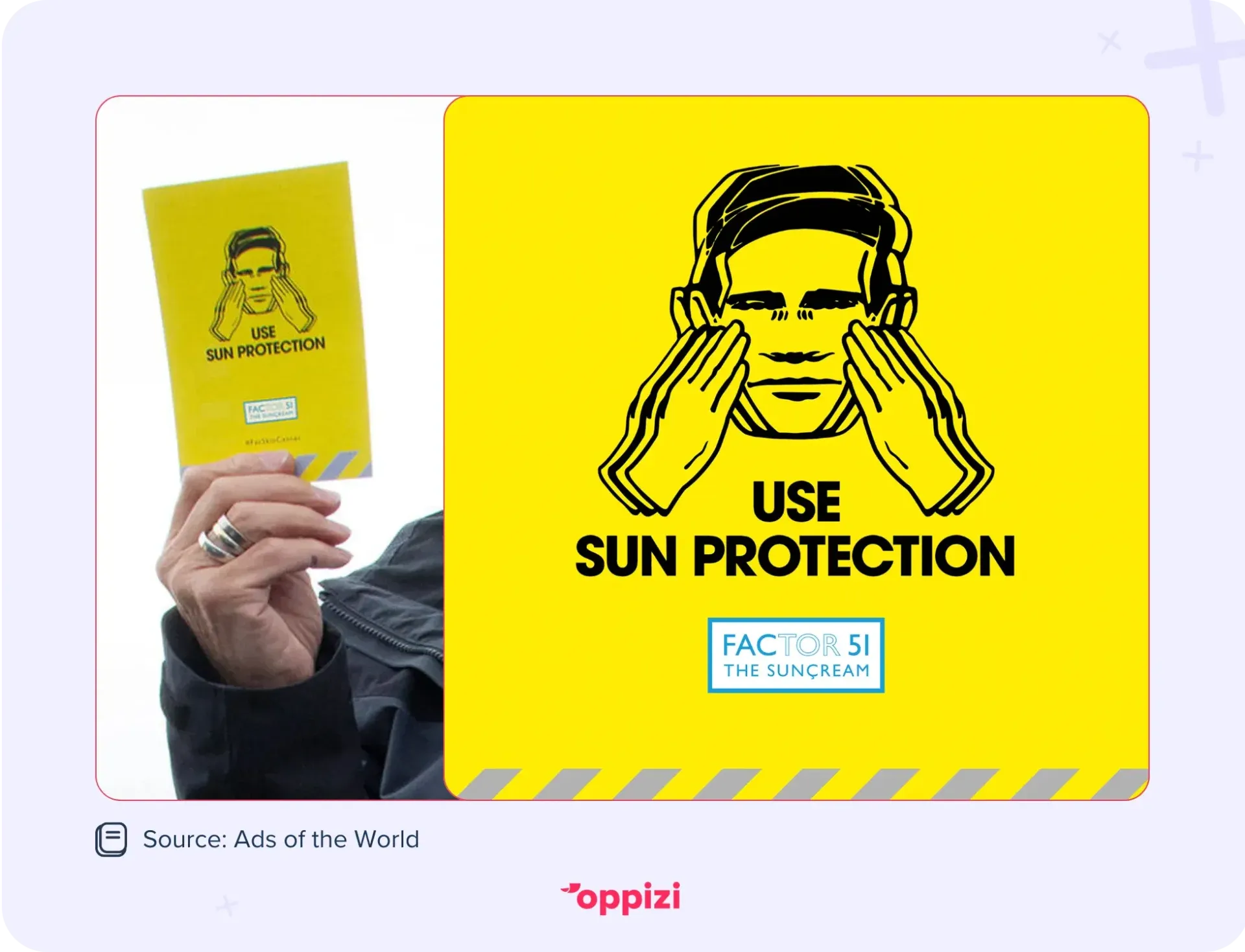
FACtor51 The Suncream handed out free samples at a UK festival. Simultaneously, they gave out flyers. But why bother with flyers if people already had the product? The answer is simple: the CTA. The flyers told people exactly what to do. “Use sun protection.”
Without that message, you’re just giving something away with no direction. Sure, putting on sunscreen seems like common sense. But people often don’t act unless they’re prompted. A clear call to action turns a freebie into a nudge to actually use it.
“The wording of your call to action can be more powerful than any design,” says Alberto Granzo, Head of Operations at Oppizi. “Sometimes, a simple QR code on a plain sheet works better than a cluttered design. Flyers stick in people’s minds days later. Something triggers them to remember that catchy CTA in their coat pocket, and that’s when they take action.”
25 flyer CTA examples for different goals
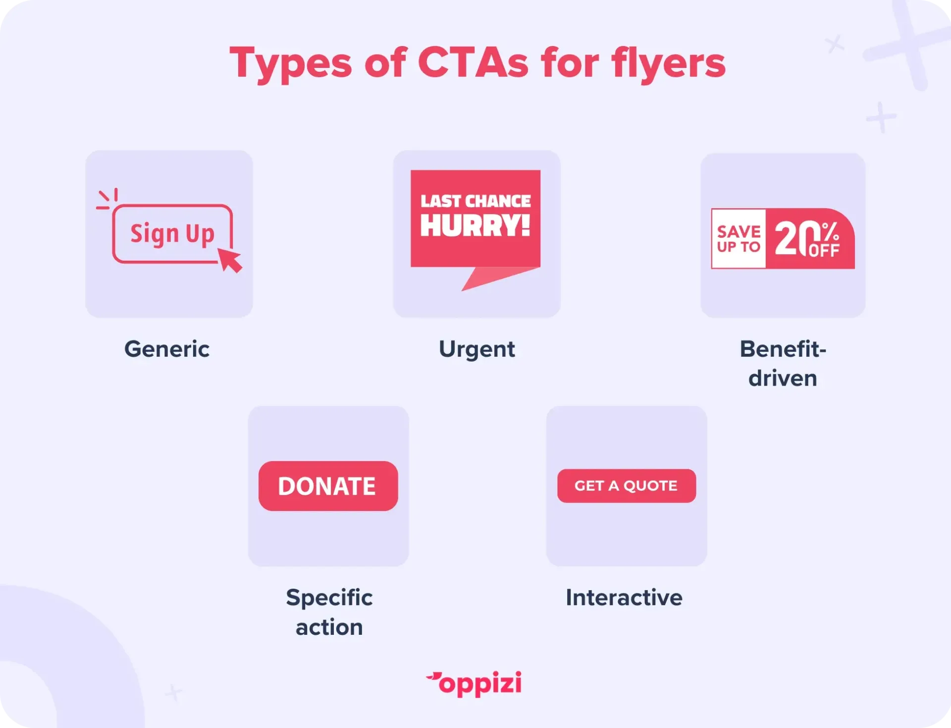
Not all CTAs work the same way. The best ones depend on what you want people to do. Most fall into five types:
- Generic: simple and flexible, like “Sign up” or “Learn more.” Great when space is tight or you need a broad message.
- Urgent: pushes people to act fast. “Buy now” or “Limited spots available.” Perfect for events or limited-time offers.
- Benefit-driven: focuses on what someone gets. “Get free shipping” or “Save 25% instantly.” Works best when the reward matters most.
- Specific action: tells people exactly what to do. “Book a consultation” or “Start your free trial.” Ideal for services and events.
- Interactive: gets people involved.“Take our quiz” or “Scan for your custom routine.” Good for building engagement or collecting leads.
You’ll see these types in action below, tailored to different goals, such as events, promotions, services, and more.
Events
You want people to commit, sign up, or show up, often with urgency.
- Book your ticket now(Urgent + Specific)
- Save your seat today(Urgent)
- Join the celebration(Generic)
- Claim your free entry(Benefit-driven)
- Register for our free workshop(Benefit-driven + Specific)
Tip:Event flyers work best with urgent CTAs that create FOMO, paired with clear next steps.
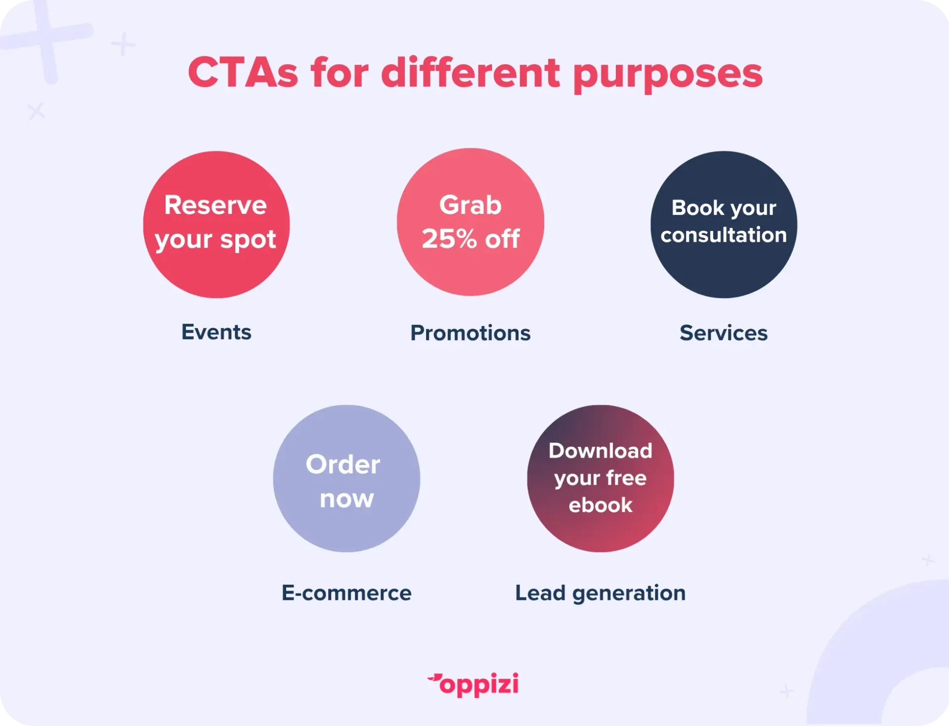
For promotions
These offers are time-sensitive and often value-driven. Make the benefit obvious.
- Get 25% off with the code on this flyer(Benefit-driven)
- Claim your discount in-store(Urgent + Benefit-driven)
- Buy one, get one free(Benefit-driven)
- Order today and save(Urgent + Benefit-driven)
- Shop now. This week only(Urgent)
Tip: Highlight the reward, then layer in urgency. The combo drives faster action.
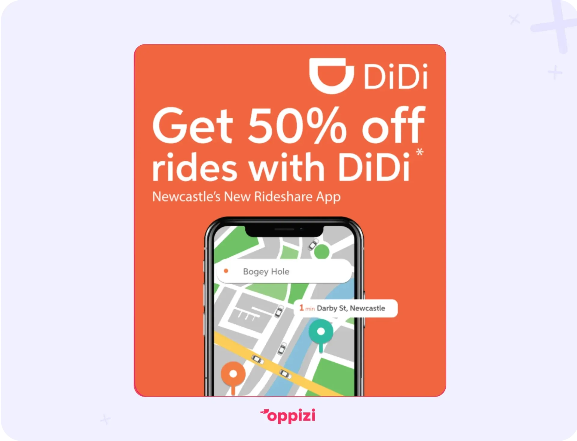
DiDi’s flyer gets straight to the point: 50% off your next ride when you use this flyer. So, what makes this different from an amateur promo flyer? It’s not just the clean layout and bold, easy-to-read text. DiDi doesn’t just tell you about the deal. They push you to act.
How? With a simple but powerful verb: “Get.” It tells you exactly what to do, turning the discount into an immediate call to action.
For services
Focus on building trust and guiding the next step clearly.
- Book your free consultation(Benefit-driven + Specific)
- Schedule a demo(Specific Action)
- Get a personalized quote(Benefit-driven + Interactive)
- Call now to get started(Urgent + Specific)
- Let’s talk about your project(Interactive + Generic)
Tip: For services, specific action CTAs build clarity, while benefits add motivation.
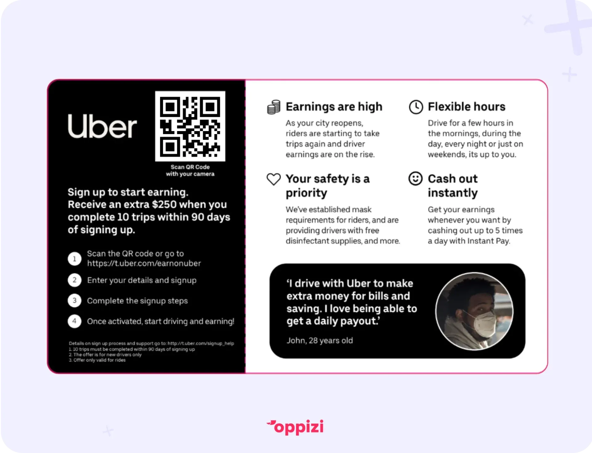
The CTA under the QR code tells you to scan it with your camera. But how do you know what you’re getting? That’s where the second CTA comes in. The bold, clear text underneath explains exactly what to do and what you’ll get in return.
After that, it’s simple. You scan, and you’re just moments away from earning money.
For e-commerce
Encourage impulse buys or deeper browsing. Fast and easy is key.
- Add to cart(Generic)
- Buy now. Limited stock!(Urgent)
- Visit our website to order(Generic + Specific)
- Start your free trial(Benefit-driven)
- Shop the full collection online(Generic)
Tip: Pair generic or urgent CTAs with a clear path to action. Simple words like “Buy” or “Shop” convert best.
For lead generation
You’re offering something in exchange for contact info or interaction. Focus on value.
- Download our free guide(Benefit-driven)
- Get your free checklist(Benefit-driven)
- Subscribe to stay updated(Generic)
- Join our mailing list(Generic + Interactive)
- Take our quiz(Interactive)
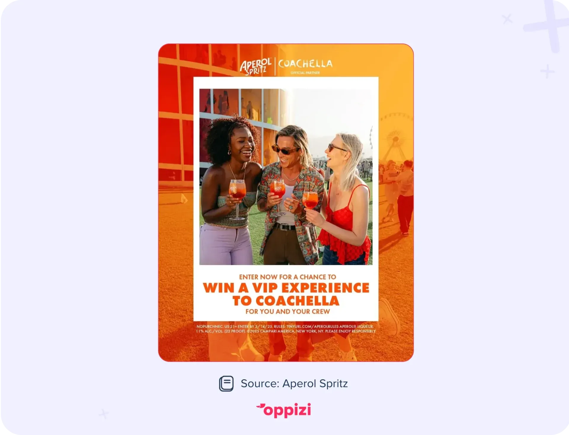
Although this is a digital flyer, it works just as well as a printed one. Aperol Spritz tells you to enter the competition “now.” Not “whenever you feel like it” or “later while you’re watching Netflix.” Now, because urgency drives action.
And why should you do it? The next line makes it clear. You might win, you might not, but once you’ve signed up, Aperol Spritz has captured you as a lead. That’s the real goal: offer something enticing, create urgency, and turn interest into a valuable contact.
For products
You want people to try, test, or buy. Focus on benefits and make it feel easy.
- Try it risk-free today (Benefit-driven + Urgent)
- Grab yours before it’s gone (Urgent)
- Experience the difference yourself (Benefit-driven)
- Order your first pack now (Specific Action)
- Get started with our best-seller (Benefit-driven + Specific)
Tip:Product CTAs work best when they reduce hesitation. Pair urgency or benefits with simple, action-focused verbs.
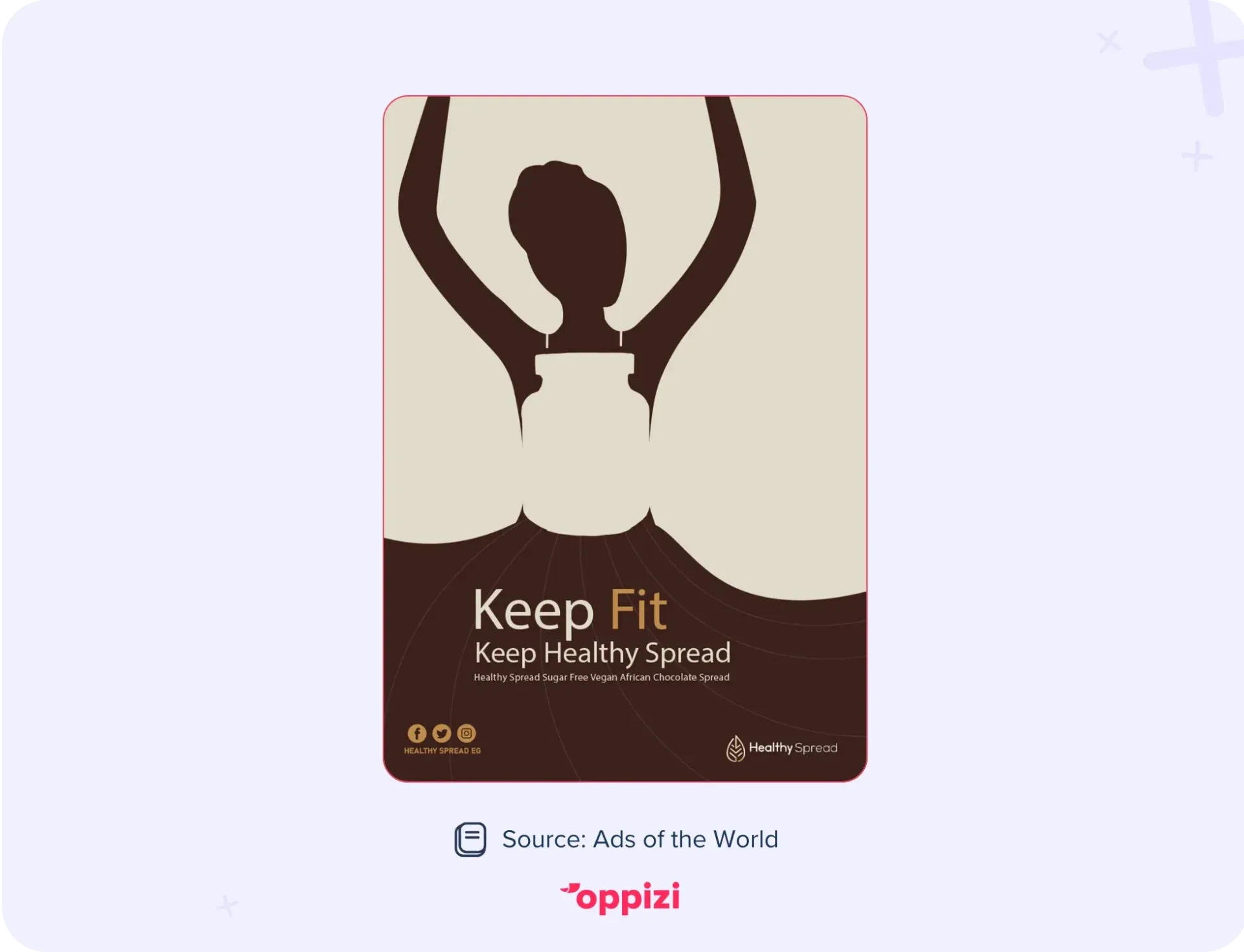
Healthy Spread could have taken the usual route, telling you to buy now and filling the ad with details about being 100% natural, low-fat, and sugar-free. Those points matter, but they were printed on the other side.
What takes center stage instead is their simple tagline: “Keep fit, keep Healthy Spread.” Why does it work?
- The text is minimal, avoiding clutter that confuses readers or makes them lose interest.
- More importantly, the tagline doubles as a CTA. The action words “keep fit” subtly push the reader to do exactly that, by making sure they have a jar of Healthy Spread at home.
A simple formula that works:
[Action verb] + [Benefit] + [Urgency (optional)]
Example:
“Download our free guide today”
- Action: Download
- Benefit: Free guide
- Urgency: Today
Before-and-after examples:
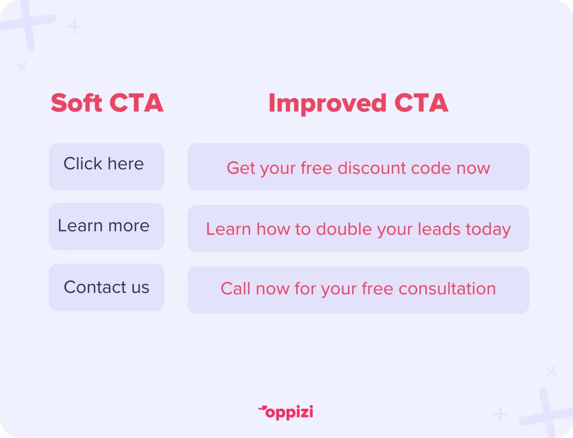
Notice how the improved CTAs follow a clear formula that guides customers toward a specific action. Softer CTAs, however, are shorter and often easier to read, and in many cases, can actually perform better for that reason.
Does CTA size matter?
A/B testing different types will show you what works best for your audience, but keep this in mind: online CTAs are usually short and direct because they’re placed on clickable buttons. For flyers, short and simple still works, but you have more room to add details and get creative.
In print, there’s nothing to click. If you want someone to visit your store, check out your website, or attend an event, they need to take action in the real world. A QR code can help bridge the gap (for example, “Scan to get 10% off”), but beyond that, your CTA needs to motivate them to take that next step on their own.
Tips to keep in mind:
- Be clear, not clever
- Focus on one action
- Make it match the flyer’s design
- Use bold text, a button, or a QR code to make it stand out
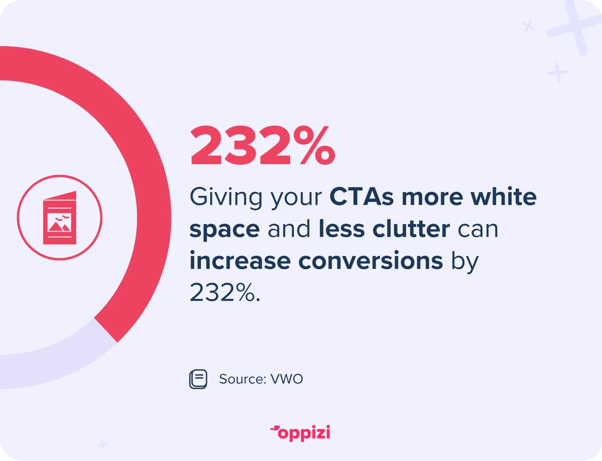
But it’s not just about your choice of words. It’s also about the visuals. CTAs with plenty of white space around them can boost conversion rates by 232%, as reported by VWO. This shows it’s not just about the words you use, but also how and where they appear to grab attention.
How to test and improve your flyer CTA
Not sure your CTA is working? Try these simple ways to check and improve it.
1. Use tracking tools
Track how people respond to each version of your flyer.
- QR codes: Make a different code for each version and count the scans.
- Custom URLs: Use short links like yourbrand.com/flyer1 to see which ones get visits.
- Coupon codes: Try a different discount code for each batch to track redemptions.
2. Try A/B testing
Print two flyers with different CTAs.
- Version A: “Get Your Free Guide Now”
- Version B: “Download Our Starter Kit Today”
Hand them out in equal amounts. Then check which one gets more visits or uses.
3. Ask your audience
If you can, ask customers how they heard about you. Find out what made them take action.
4. Small changes matter
Even one word can make a difference. For example:
- “Learn More” vs. “See How It Works”
- “Book Now” vs. “Claim Your Spot”
5. Keep updating
Your flyer CTA isn’t permanent. Change it when needed.
- New season? Try “Get Ready for Summer.”
- New product? Update your offer.
- New feedback? Adjust your message.
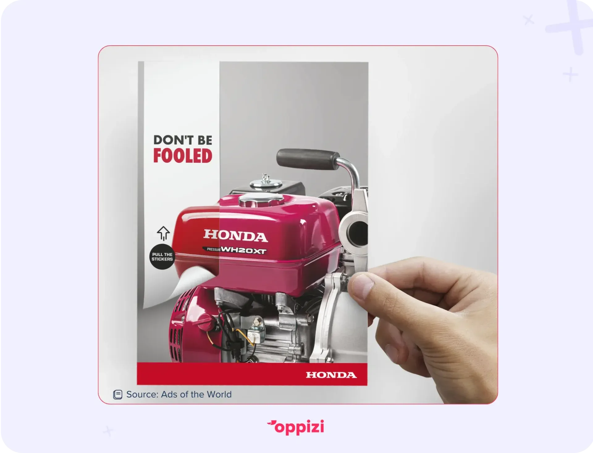
What makes this Honda anti-piracy flyer stand out is that it tells you what not to do rather than what to do. “Don’t be fooled.” No one wants to feel tricked, which is why this CTA instantly triggers an emotional response. It also sparks curiosity. Fooled by what?
The message is short, memorable, and clear. It pushes people to act, even without a direct instruction, and it positions Honda as the trusted authority warning consumers against counterfeit products.
What to avoid in your CTA
Even pros make mistakes. Here are some things to watch out for.
1. Too vague
Weak: “Click Here”
Better: “Download the Spring Catalog Now”
2. Too many CTAs
Stick to one action. Don’t ask people to sign up, call, and follow you all at once.
3. Hard to see
Your CTA should stand out. Use bold text, clear colors, or a box.
4. Passive language
Passive: “Information available upon request”
Active: “Call Now to Get Your Free Guide”
5. No clear benefit
Tell people what they’ll get. If you skip the benefit, they’ll skip the action.
CTA checklist
- Is it easy to find?
- Is it clear what to do next?
- Is there only one action?
- Does it offer something useful?
- Is the language specific, not generic?
Still not sure? Show your flyer to someone who doesn’t know your offer. Ask: “Would you know what to do next?”
What makes a CTA work on a flyer?
A good CTA is clear, simple, and well-timed. The best ones:
- Are easy to understand
- Tell people what to do next
- Offer something useful
- Stand out on the page
Flyers still work because people trust what they can hold. With the right CTA, your flyer can turn interest into real results.
FAQs: Flyer CTAs
What’s an example of a CTA?
A CTA (call-to-action) is a short line that tells someone what to do. For example:
- “Get Your Free Quote”
- “Book Your First Class Today”
- “Download the Guide Now”
Each one gives a clear next step and often offers a benefit.
If you're printing lots of flyers, try a few versions and see which one works best.
What’s the difference between a tagline and a CTA?
A tagline shows who you are. A CTA tells someone what to do.
- Tagline: “Just Do It” (Nike)
- CTA: “Shop the Collection Now”
Your tagline builds your brand. Your CTA brings in action. Flyers need both—but the CTA drives results.
What is a CTA on social media?
It works the same way. It tells people what to do next. For example:
- “Follow us for updates”
- “Click the link in bio”
- “Tag a friend who needs this”
Online or offline, a clear CTA helps people take action.
What does a CTA do?
A CTA turns interest into action. It answers: “What should I do next?”
Without one, people may like your flyer but do nothing. With one, they might:
- Make a purchase
- Book a service
- Visit your website
- Join your list
It’s just one line, but it can do a lot.

Make your flyer CTA count
A strong CTA isn't just a final line. It's the step that turns attention into results. Pick a CTA that fits your goal. Make it clear, simple, and useful. Test a few options and see what gets the best response.
Need an easier way to run your flyer campaigns? Oppizi helps you plan, print, and deliver flyers that work. All in one place. Join now and grow your business fast.