Last updated September 28, 2026
Whether it’s handed out at an event, mailed directly to a customer’s home, or picked up in-store, a brochure puts your brand in someone’s hands. A key tool for travel agency marketing, brochures do more than inform and help create a lasting impression. In fact, 56% of people trust print advertising over any other advertising method, making brochures a powerful way to build credibility at first glance. But here’s the thing: most brochures get tossed in the bin within seconds. Why? Because of poor design.
Designing a brochure isn’t just about throwing some text and images onto a folded sheet of paper. It’s about crafting a compelling experience. One that reflects your brand, speaks directly to your audience, and drives action.
This guide walks you through every step of the design process, from choosing the right layout to creating a standout call-to-action, so your brochure isn’t just read, but remembered.
Let’s dive in and find out how to design a brochure that’s worth holding onto.
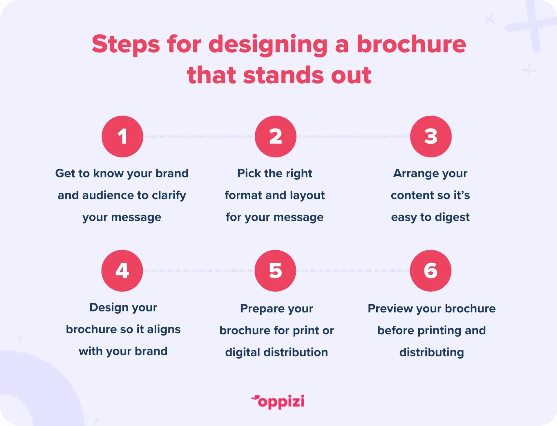
Know your brand and audience
Before diving into design, it’s important to know who you’re speaking to and the message you want to convey:
1. Define your brand personality
Solidify your brand’s tone - whether it’s playful, professional, eco‑friendly, or luxurious. Every visual choice (like your fonts, colors, and icons) should reinforce that tone.
2. Identify your ideal customer
Know who you're talking to. Are they visual learners or detail-oriented readers? Understanding this helps you craft visuals, messaging, and layout that resonate.
3. Clarify your core message
Understand your brochure’s purpose. Are you promoting a service, sharing how-to info, or driving customers to your website? A clean, focused message makes every design choice count.
4. Set success metrics
Choose how you’ll measure the impact of your brochure. This could be through coupon redemptions, QR scans, or traffic to custom URLs. These KPIs influence everything from layout to tracking tools.

Pick the right format & layout
Choose a brochure type
The structure of your brochure plays a big role in how your message is received. Consider how much information you need to include, how visual your content is, and how you want the reader to interact with it.
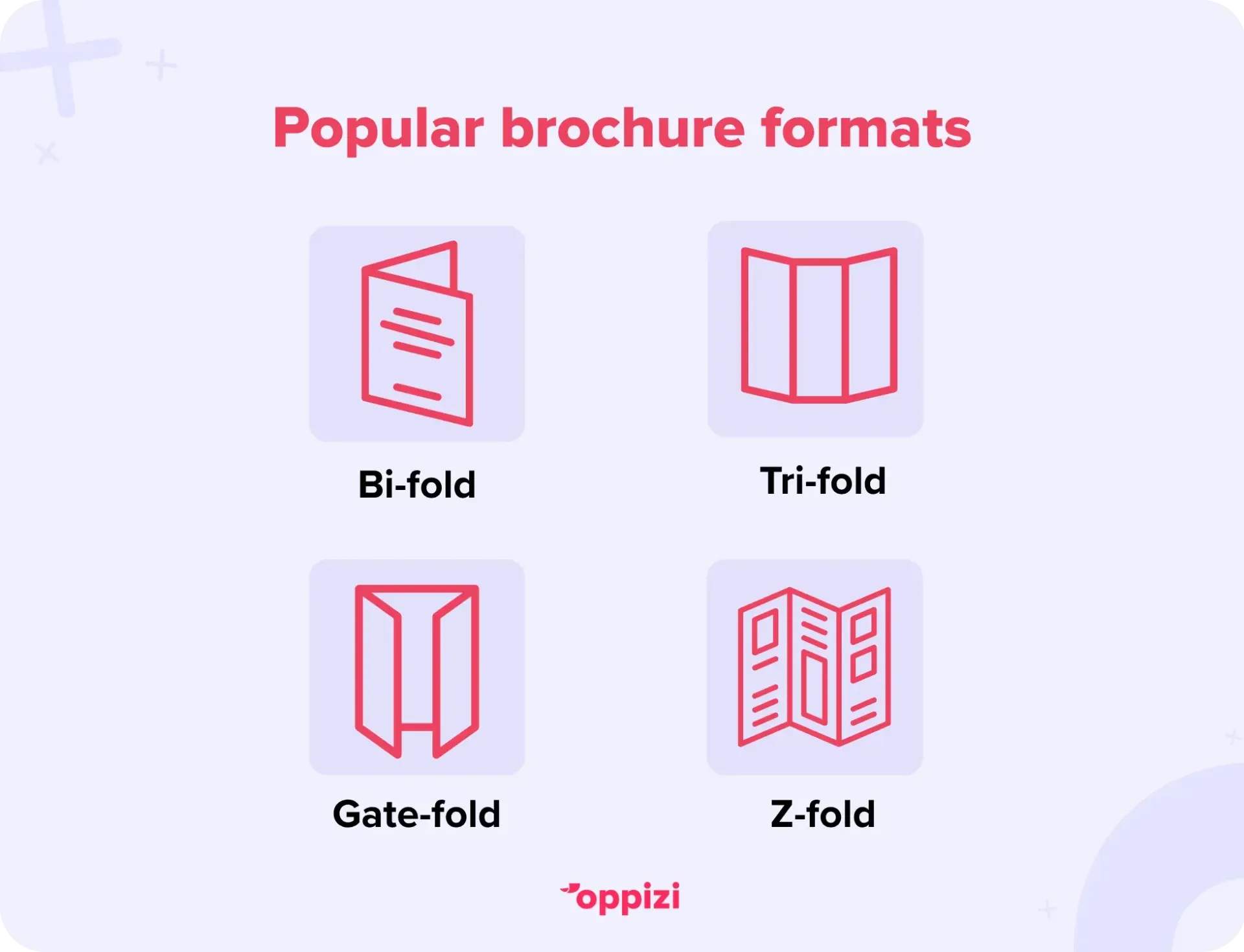
Here are some popular brochure formats and when to use them:
- Tri-fold (6 panels): The most common format, great for businesses that need to present multiple sections, like services, testimonials, and contact info, in a clean, organized way. Ideal for brochures with a balanced mix of text and images.
- Bi-fold (4 panels): Offers a sleek, spacious layout with fewer folds. It’s perfect for showcasing bold visuals or fewer, high-impact sections. A good choice for product spotlights, menus, or service highlights.
- Z-fold or Gate-fold: These creative formats are attention-grabbing and lend themselves well to storytelling or step-by-step experiences. They’re often used for event promotions, product launches, or high-end brand pieces where the "reveal" is part of the experience.
Choose a layout that complements your content and helps guide the reader naturally from start to finish.
Select a size that fits
Common sizes include A4, A5, and DL (typically 210x99mm). A4 works best for info-rich content, while DL is smart for mailers and compact messaging.
Map your panel content
To ensure a logical layout, begin by sketching a mock fold on paper. Assign content to each panel: cover, key highlights, detailed information, and a call to action. This will help organize your brochure's flow effectively.
Arrange your content coherently
Write targeted, digestible copy
Keep text punchy. Use bold headers, bullet lists, and short paragraphs. Tailor the tone to your target audience.
Choose high-quality visuals
Use authentic and high-resolution images or icons that reinforce your message. Aim for visual consistency with a unified color palette and visual style.
Include helpful elements
Consider adding:
- A brief FAQ section to answer common questions or doubts
- How-to guides or quick tips
- Testimonials for social proof
Design: Make it readable & on-brand
Follow brand guidelines
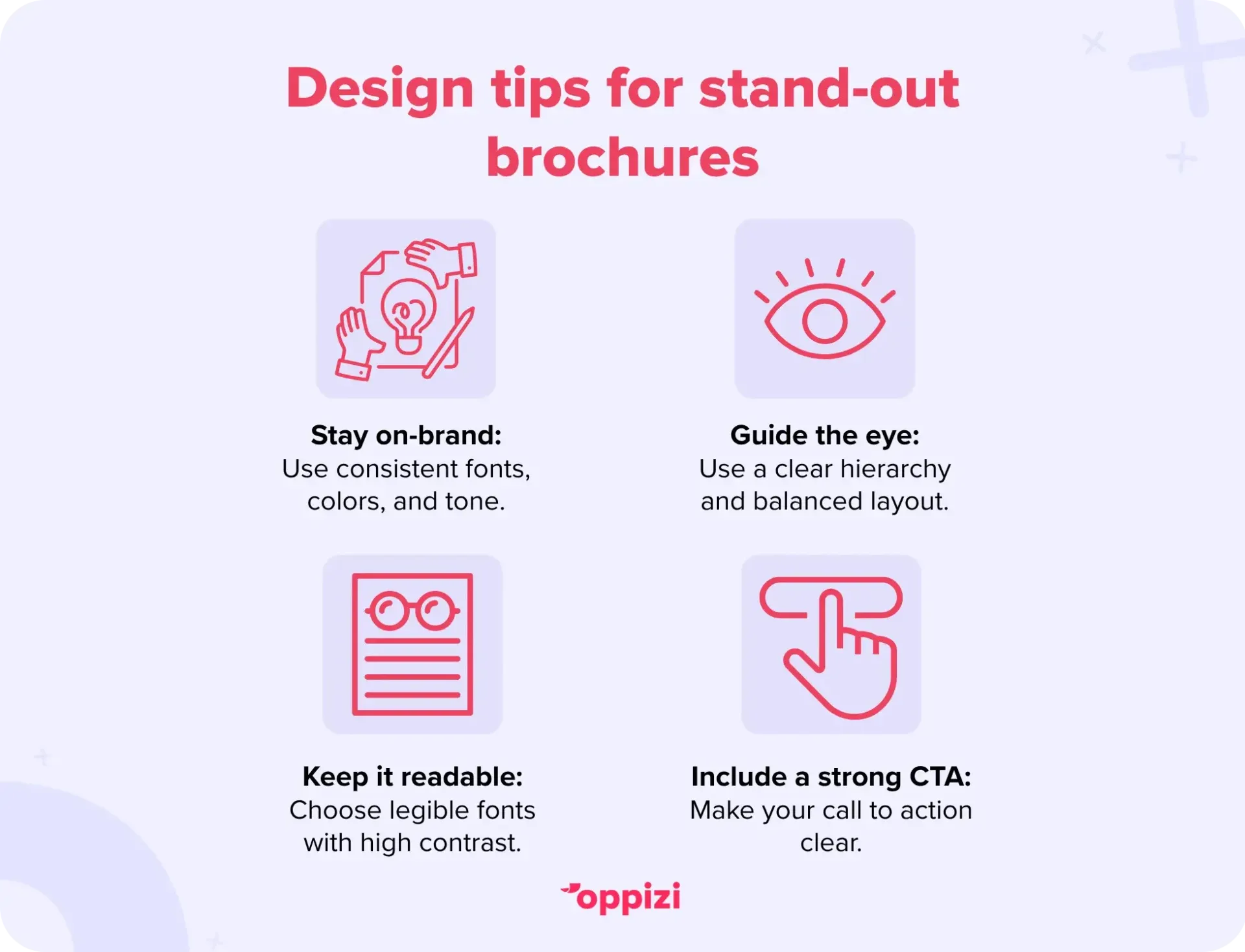
Apply consistent fonts, color schemes, and tone. All elements should reflect your brand’s identity consistently across panels.
Prioritize visual hierarchy
Lead readers through your layout: large headline, compelling imagery, concise details, and a clear CTA. Balance visuals and whitespace to guide your reader’s attention to where it’s required.
Choose readable fonts & contrast
Select easily legible typefaces (e.g., sans-serifs) and pair them well. Maintain a high contrast between the text and background to ensure readability.
Use a strong CTA
Every brochure needs a purpose. Make your CTA visible and actionable. These can include links, QR codes, phone numbers, coupons, or invitations to visit in person or online.
Polish for print or digital
Although most people print their brochures, they can also be distributed digitally. In any case, it’s important to prepare your brochure to ensure it’s ready for printing or digital distribution.
For print
- Use CMYK color mode and proper bleed/margins for clean, accurate results.
- Choose paper stock that reflects your brand. This can be matte, glossy, recycled, or uncoated.
- Test print to catch layout or color issues before the full run.
- Add QR codes or personalized URLs to link print to digital. This is great for offers, menus, or bookings.
For digital
- Export in RGB and compress files for quick loading and sharp display.
- Add interactive features like links, videos, and QR codes for extra engagement.
- Use analytics tools to track clicks, views, and user behavior.
Preview, print & distribute
Evaluate your design
Before sending anything off, take a final look at your mock-up with fresh eyes, or, even better, ask a colleague for feedback. Make sure your layout flows smoothly, branding is consistent, text is legible, and your call-to-action is easy to spot. A strong first impression matters.
Choose a reliable printer or digital platform
Select based on your distribution strategy:
- Physical brochures: Work with a trusted printer. Compare paper weights, finishes, and fold types to match your goals and budget.
- Digital brochures: Platforms like Canva or Marq make it easy to host your brochure online with interactive features like videos, links, and analytics.
Distribute strategically
- In-person: Hand them out at trade shows, events, or display them in high-traffic locations.
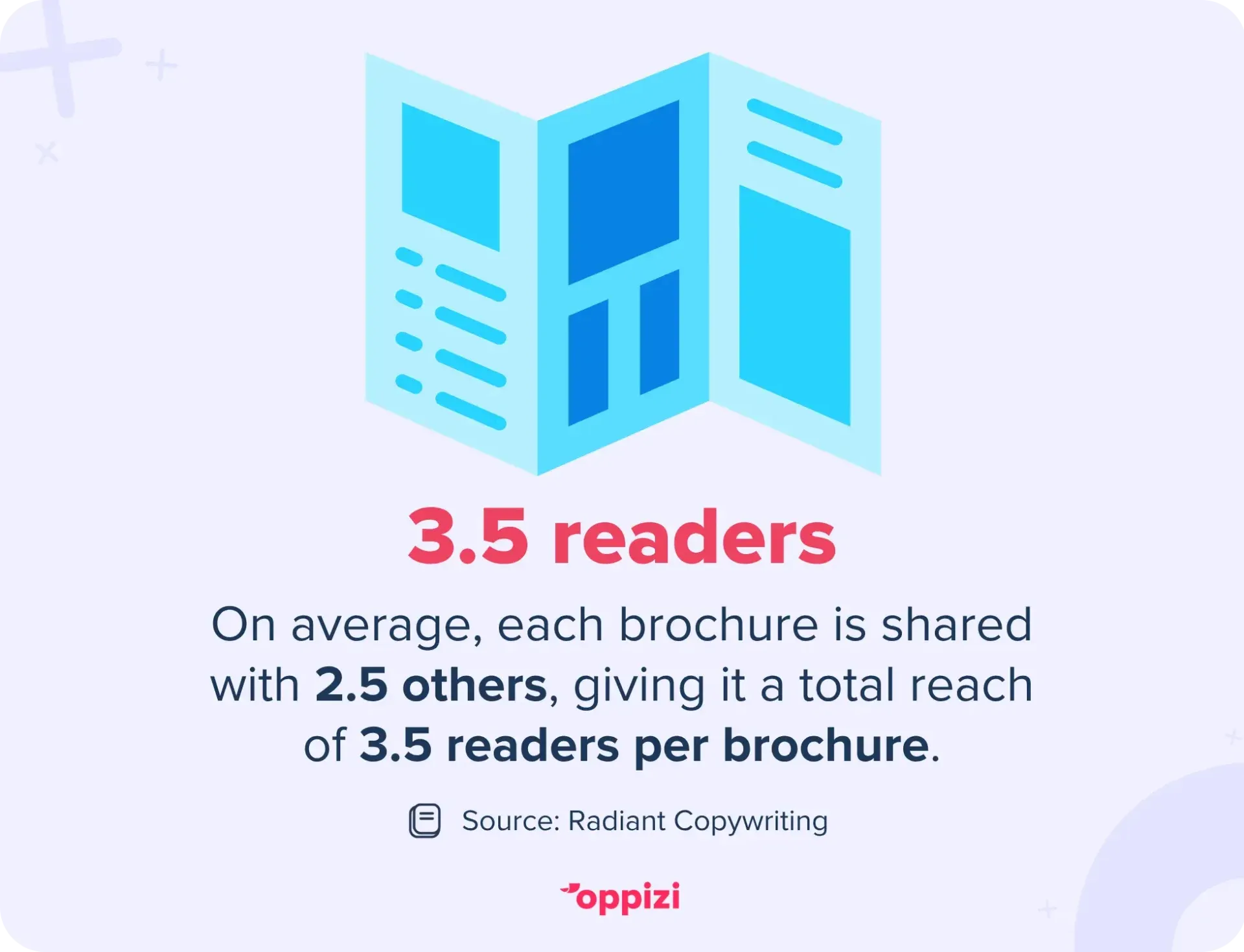
- Direct mail: Send brochures to a targeted audience for better ROI. On average, each brochure is shared with 2.5 others, giving it a total reach of 3.5 readers per brochure. That means your message has the potential to travel further than you might expect, making print a powerful tool for building brand awareness.
- Digitally: Share via email, embed in landing pages, or connect print to web with QR codes placed in physical marketing materials.
Common brochure mistakes to avoid
Even well-designed brochures can fall short if small errors slip through the cracks. Here are a few common mistakes to watch out for:
- Overloading panels with text: Less is more. Crowded layouts can overwhelm readers and make your message unclear.
- Lack of visual hierarchy: If everything’s the same size or style, nothing stands out. Use headings, contrast, and layout to guide the reader’s eye.
- Using low-quality visuals: Blurry images instantly damage your brand’s credibility. Stick to high-resolution visuals that reinforce your message.
- Forgetting key info: It sounds obvious, but it happens. Double-check that your contact details, CTA, and key messages are present and easy to find.
- Ignoring the fold: Misjudging how your brochure folds can lead to awkward breaks in content. Always mock up your design to ensure it has a logical flow and proper alignment.
Avoiding these small but common issues can make the difference between a forgettable brochure and one that gets noticed.

Conclusion
Designing a great brochure is more than just arranging text and images - it’s a strategic process. From knowing your audience to creating a visually balanced layout, every detail plays a role in delivering impact. Clear messaging, a strong call-to-action, and thoughtful distribution can turn a simple brochure into a powerful marketing tool.
Offline marketing is a valuable way to make meaningful, real-world connections with your audience. If you’re ready to add offline channels like direct mail or flyer campaigns to your marketing mix, why not partner with Oppizi?
Ready to make an impact offline? Start your campaign with Oppizi today!
Frequently asked questions
- What brochure format is best?
The ideal brochure format depends on your content and goals. A tri-fold layout allows you to divide information into clear, digestible sections. If you want to showcase bold visuals with concise text, a bi-fold offers a clean, spacious design. For a more creative approach, Z-fold or gate-fold brochures are perfect for storytelling or dramatic reveals.
- How can I design a brochure quickly?
If you need a brochure quickly, you can use templates on tools like Canva. Templates help maintain branding consistency and speed up the entire design-to-print process.
- What paper choice makes the biggest difference?
Higher-quality paper makes an immediate impression. Matte or soft-touch finishes can communicate premium value, while recycled stock reflects eco-consciousness.
- What makes a brochure stand out?
Standout brochures blend striking visuals, clean design, and clear messaging. Quality materials can elevate the overall perception, while interactive elements boost engagement. Additionally, strong branding and a compelling call-to-action are crucial.
- Should a brochure be landscape or portrait?
It depends on your content and how you want it to be experienced. Portrait is more traditional and easier to handle, especially for tri-folds or bi-folds. Landscape can offer a modern touch and works well for showcasing landscape visuals or panoramic layouts.
- What is the best program to make a brochure?
Popular tools include Canva for beginners or quick designs, and Adobe InDesign for professional-level layouts. Choose a program based on your skill level and project needs.