Last updated July 23, 2026
Sick of wasting money on flyers that nobody looks at? Most flyers get ignored because they are boring, messy, or don’t have a clear message. But with a few simple changes, you can make a flyer that catches the eye and gets people to act.
Print marketing still works. In fact, 79% of people keep, read, or at least scan flyers and other advertising mail. The right flyer design and plan can put your business in front of people who want to buy.
This guide shares ten easy ways to make flyers that stand out, grab attention, and bring real results for your product, service, or event.

1. Clear and concise messaging
Your flyer needs one clear message people get right away. Clear messages help your flyer stand out and connect with customers fast. The goal is to share your main offer in a simple, easy-to-remember way.
How to do it:
- Use a headline that grabs attention and sums up your key message in just a few words
- Keep the body text short; bullet points or brief paragraphs work best.
- Stick to one main idea per flyer. Too much information can confuse people.
Example:
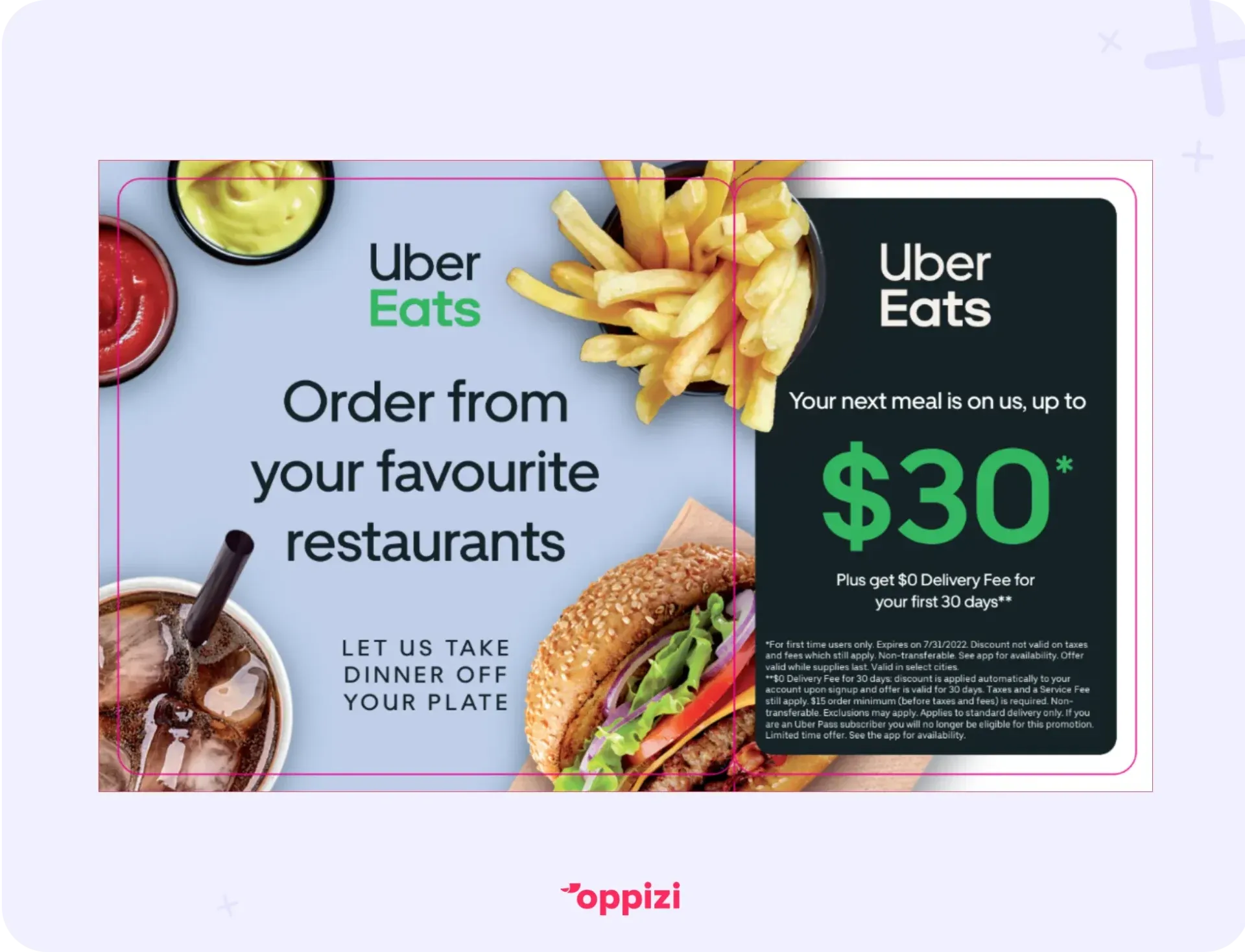
Uber’s flyer with the line ‘Order from your favourite restaurant’ is crystal clear. You instantly know what the flyer is about and what action to take. Compare that to a typical amateur food delivery flyer, where the main message is often hard to spot and unclear about what the customer should do.
Why it matters:
Only about 20% of people read every word of mailed ads, yet 70–80% still remember the brands a month later. A clear, simple message on your flyer can leave a lasting impression, even with brief exposure.
2. Eye-catching visuals
Images are key to grabbing attention or getting ignored. In fact, print ads that combine images with text boost ad recall by 11% and brand recognition by 5% compared to text-only ads. Good visuals make your flyer stand out and support your message.
How to do it:
- Use high-quality photos or graphics that match your product or service.
- Avoid generic stock photos; real and authentic images build trust.
- Match colors, fonts, and images to your brand for a consistent look.
Example:
There’s nothing complicated about the image on this Uber flyer, and that’s the point. Simplicity works. The color tones match Uber’s dark branding, but what really makes it effective is the feeling it creates.
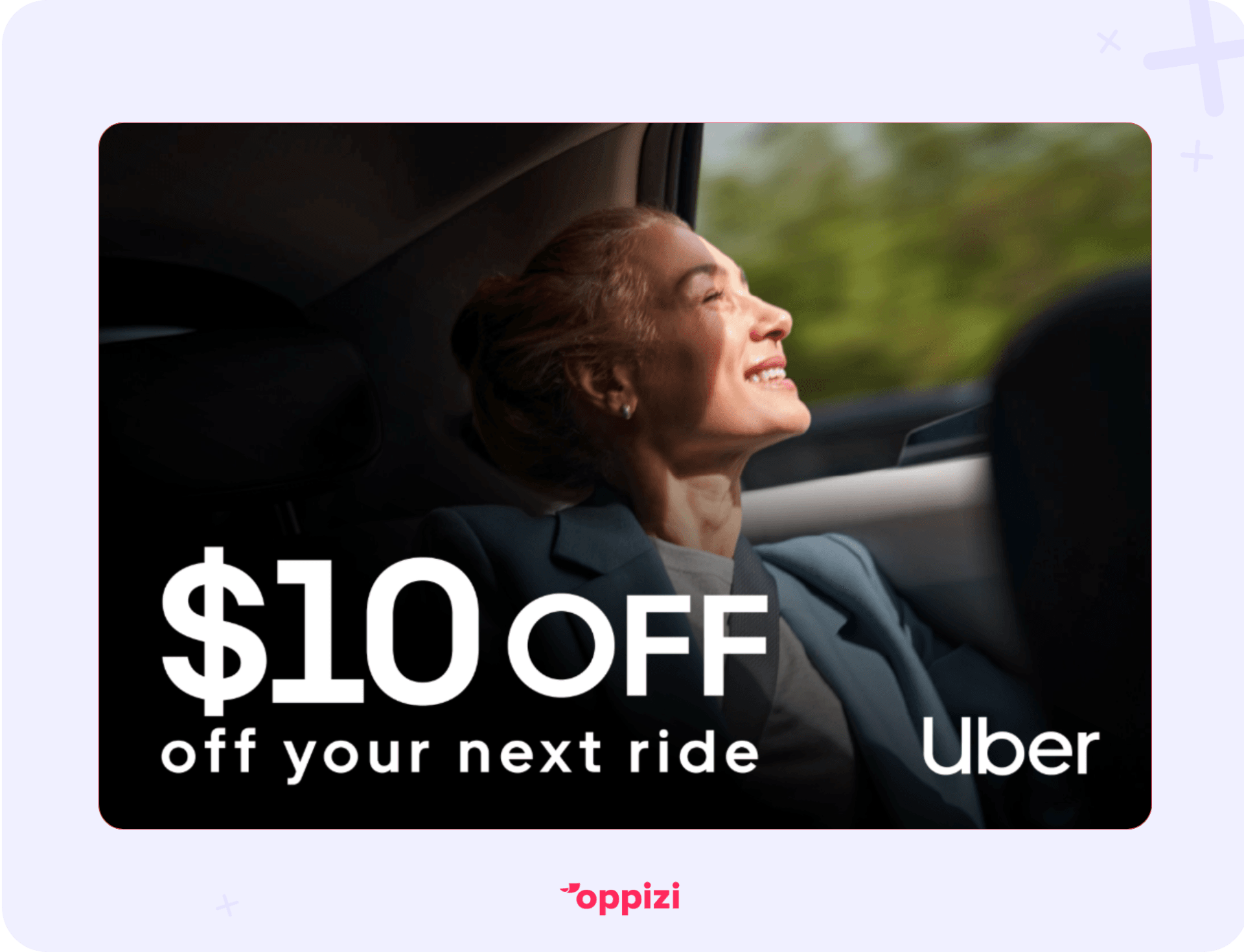
When selling to consumers, it’s not just the product or service that matters; it’s the result they get from using it. Look at the woman in the car. She’s happy. She’s relaxed. She’s clearly on her way to her destination without stress. That’s the emotion the flyer is selling, and that’s why it works.
Why it matters:
People remember only 10% of the information they hear in an ad after 3 days, but 65% when it’s paired with a relevant image. Adding strong visuals to your flyer can make your message stick long after someone sees it.
3. Strong call-to-action (CTA)
Your flyer needs a clear next step for people. A strong CTA on your flyer tells them exactly what to do next, like call, visit, or claim an offer. Without this, even the best flyer can be wasted.
How to do it:
- Use action words like “Call now,” “Order today,” or “Claim your discount.”
- Make your CTA stand out with bold fonts or colors.
- Add urgency with phrases like “Limited time only” or “Offer expires soon.”
Example:
Imagine you need to earn some money and you’re a driver, unsure which ride-sharing service to choose. Then you see the message, “Earnings are higher on Uber,” followed by the CTA, “Drive and earn today.”
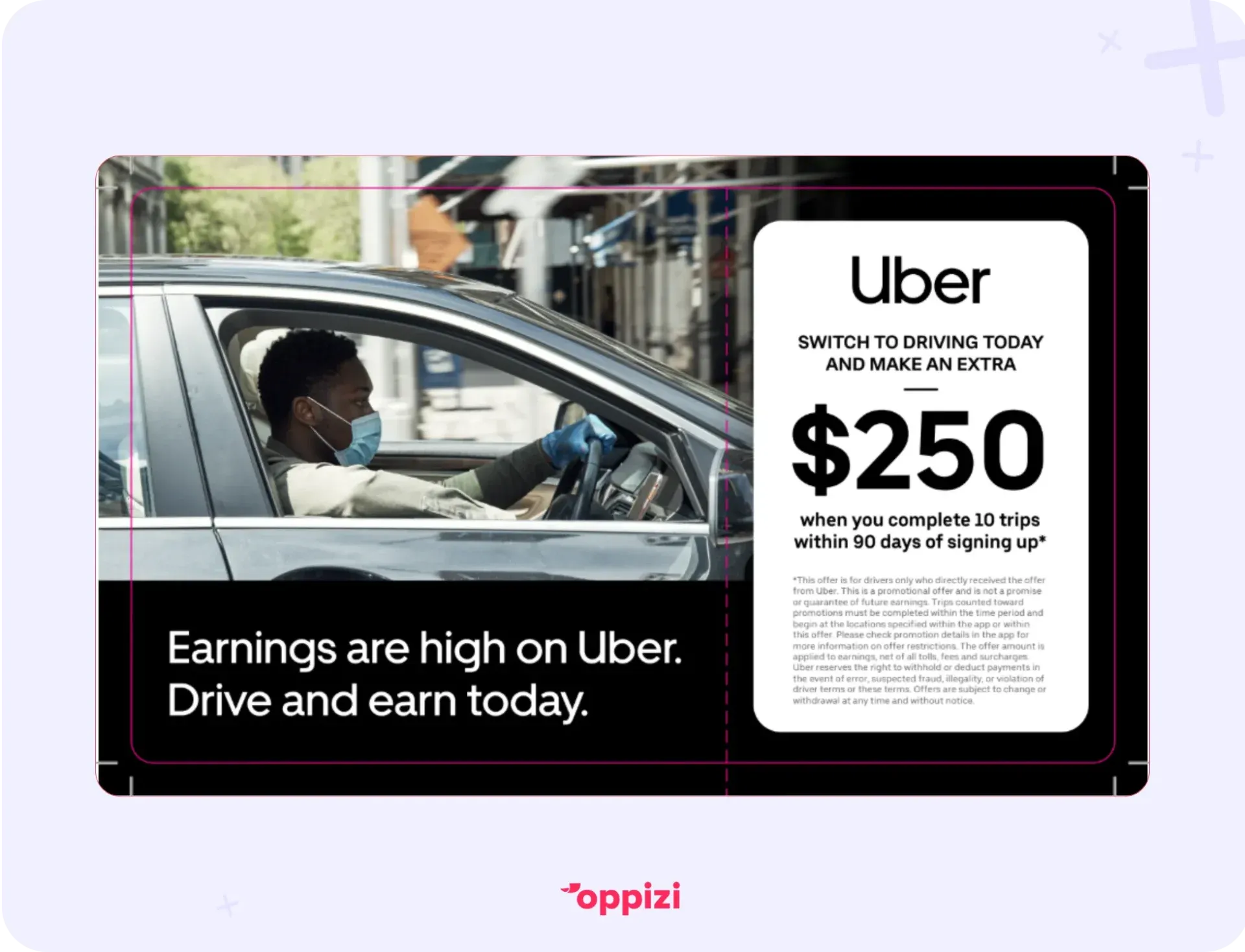
Now you have your answer. The CTA starts with a strong verb and clearly offers an opportunity focused on what you’ll get: earnings!
Why it matters:
CTAs can boost conversion rates by up to 80%. They are key to making your flyer work.
“The wording of your call to action can be more powerful than any design,” says Alberto Granzo, Head of Operations at Oppizi. “Sometimes, a simple QR code on a plain sheet works better than a cluttered design. Flyers stick in people’s minds days later. Something triggers them to remember that catchy CTA in their coat pocket, and that’s when they take action.”
4. Consistent branding
Using the same logo, colors, and fonts on your flyers and other marketing materials helps people recognize your brand. It also builds trust. Businesses that keep their branding consistent see more engagement and sales.
How to do it:
- Always use your official brand colors, fonts, and logo.
- Match the style and tone of your website and social media.
- Add your brand tagline when it fits.
Example:
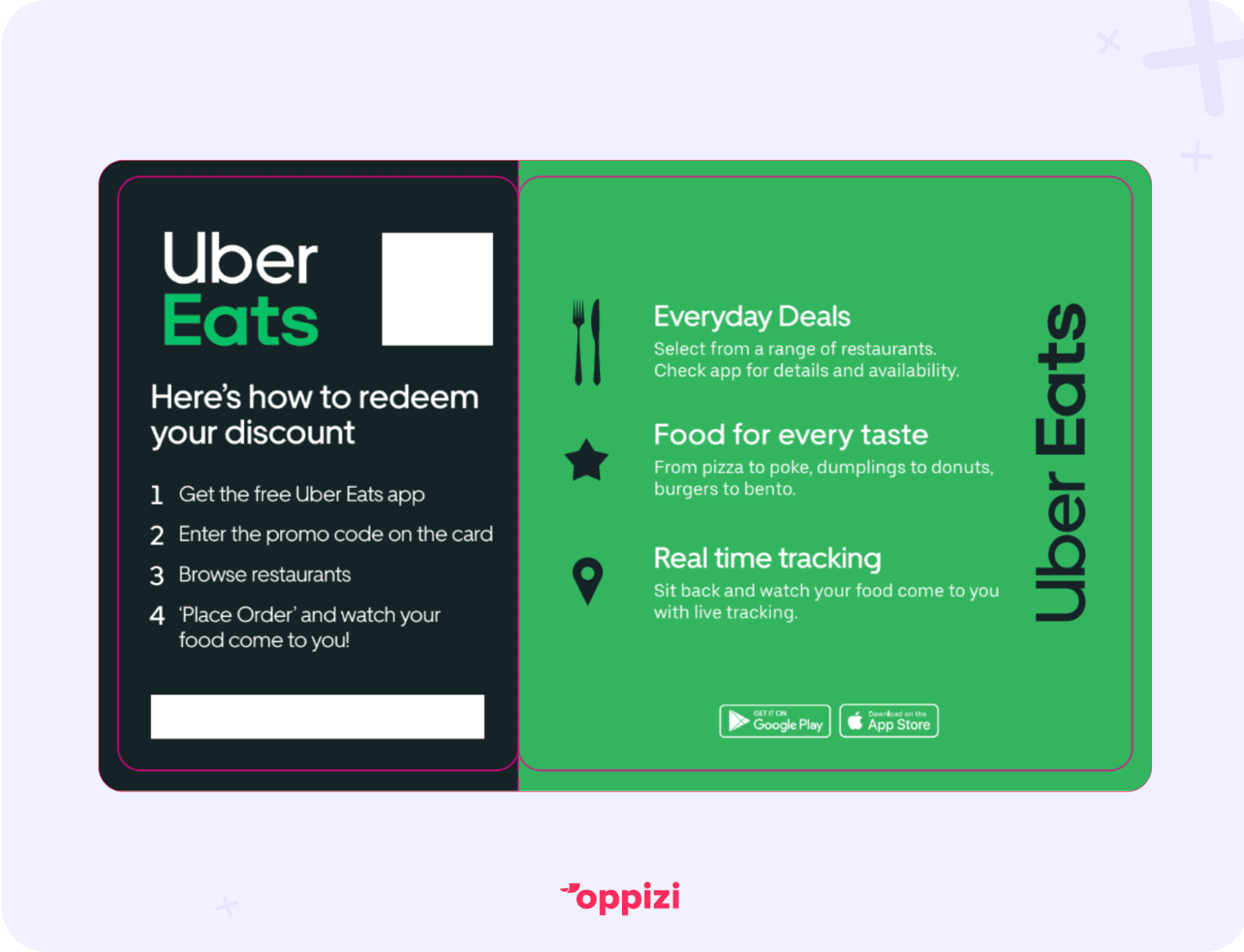
Like other major brands, Uber Eats keeps its branding consistent across all flyers and promotional materials. As shown in this example, the dark, almost-black blue paired with bold green and white text makes it instantly recognizable as Uber Eats, regardless of the logo’s visibility.
Why it matters:
Businesses with consistent branding can see up to 20% more growth and 33% higher revenue than those with inconsistent branding.
5. High-quality printing
Poor printing makes your flyer and business look unprofessional. Good printing lasts longer and leaves a better impression.
How to do it:
- Choose paper that fits your brand: glossy for bright colors, matte for a classy look.
- Think about printing on both sides for more space.
- Use clear fonts and sharp images to avoid blur.
Example:
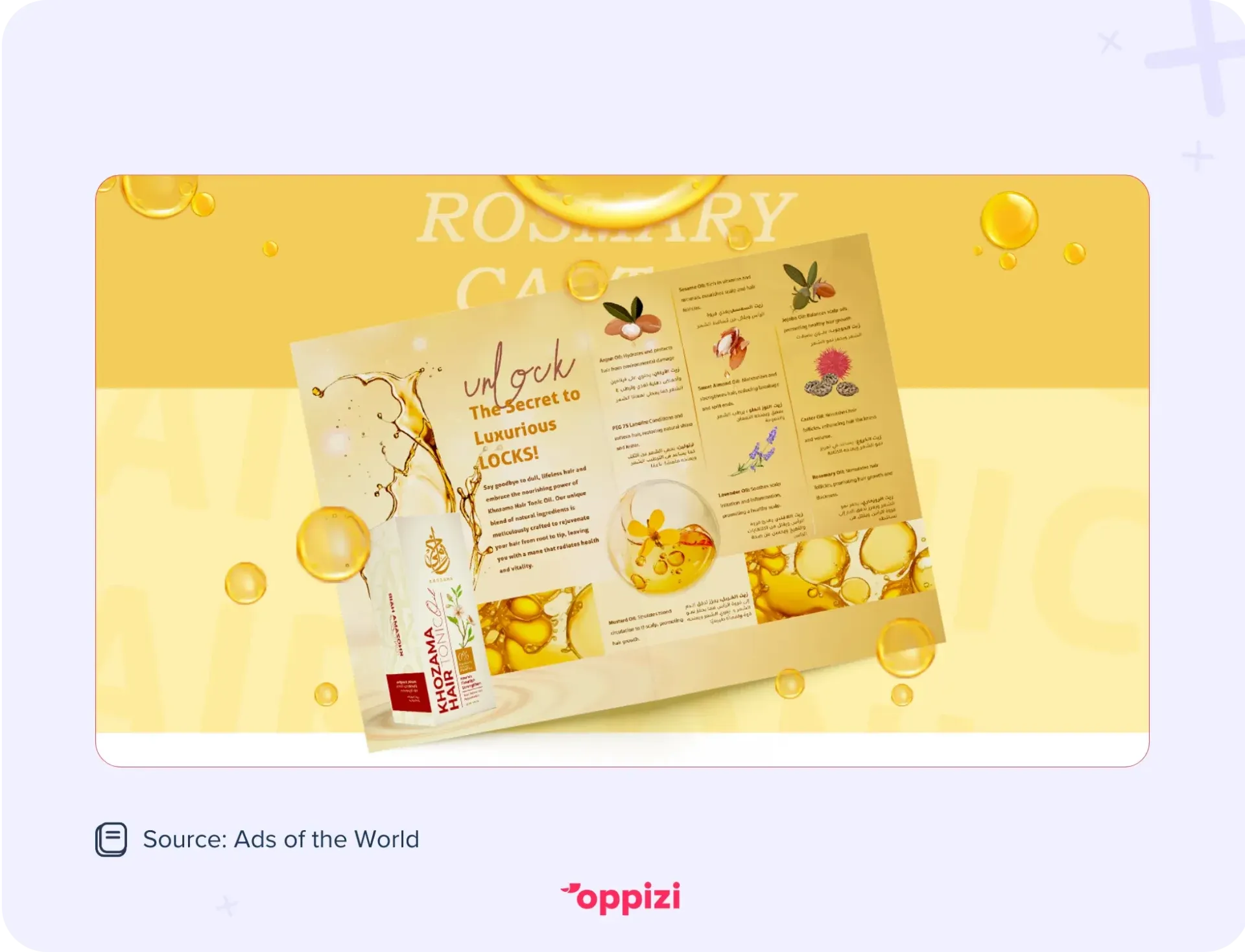
A luxury product should be printed on thick, matte paper to reflect quality and professionalism. Take a look at this flyer from Khozama. Would flimsy, easily torn paper give the same impression as something sturdy, smooth, and glossy?
6. Targeted distribution strategy
Even a great flyer won’t work if the wrong people see it. A smart plan gets your flyer to the right audience.
How to do it:
- Find busy places your customers visit.
- Hand out flyers at events or partner with local shops.
- Deliver flyers door-to-door in key areas.
Example:
A pet grooming service could hand out flyers at vets, pet stores, or dog parks. A ride-sharing app might distribute them in nightlife spots or busy transit areas. Identify your target customers, find out where they spend time, and reach them when they’re there.
Why it matters:
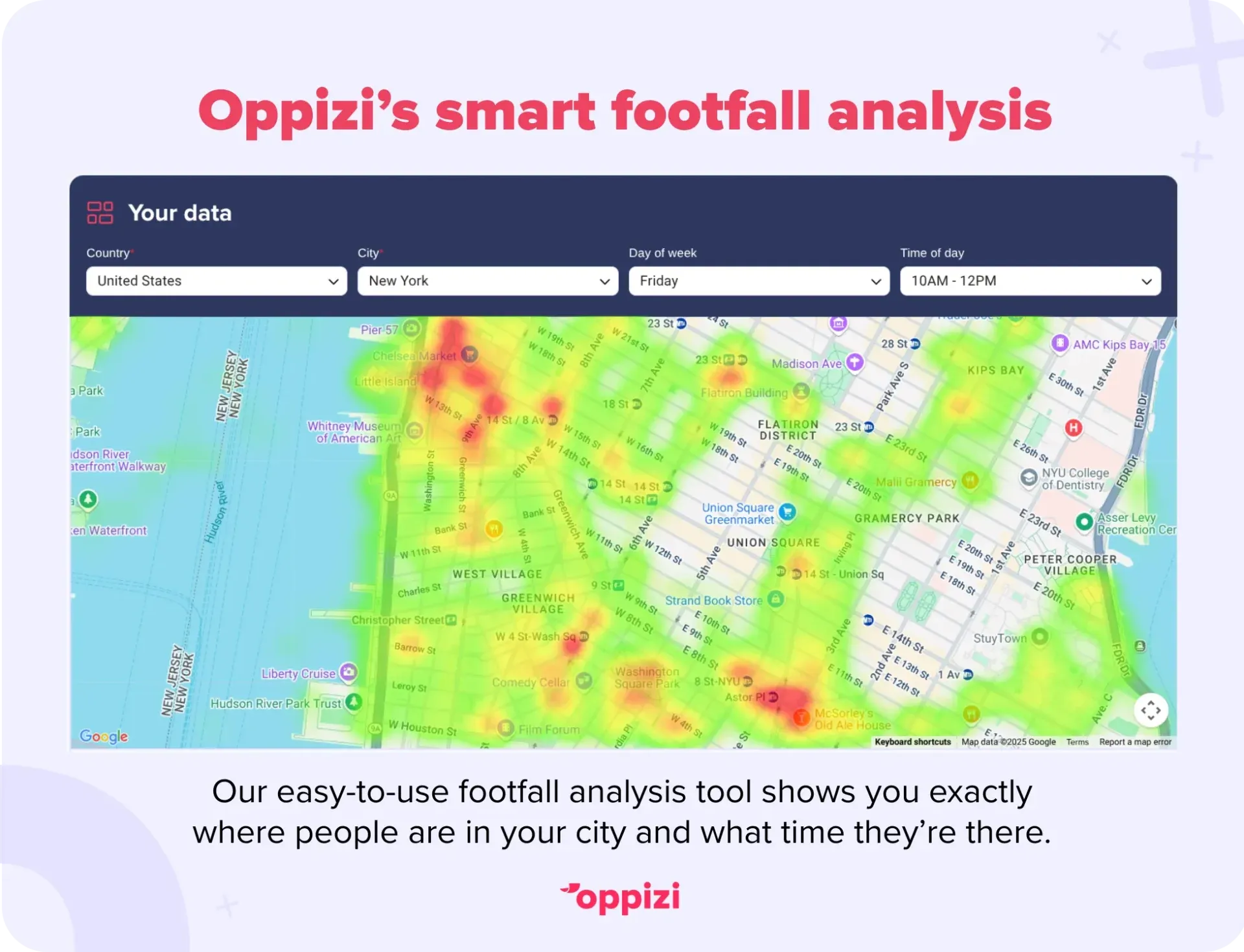
If someone isn’t interested in your service, they’ll throw your flyer away immediately. That’s why you need to target the right people at the right time. Oppizi’s free footfall analysis tool uses data-driven insights to help you find high-traffic spots and reach more potential customers.
“One of my favorite campaigns was for a hidden restaurant in a small park in central Madrid,” recalls Granzo. “We focused on local workers, letting them know about this new spot, and avoided attracting tourists during the summer. It worked perfectly because we reached the right people at the right time.”
7. Include testimonials or reviews
Real customer reviews build trust and show your business delivers. Flyers with testimonials build trust by showing you deliver on your promises, and they’ve been proven to increase conversions.
How to do it:
- Add 1 or 2 short, honest testimonials with names or initials.
- Use star ratings to highlight positive feedback.
- Make sure the reviews match the flyer’s message.
Example:
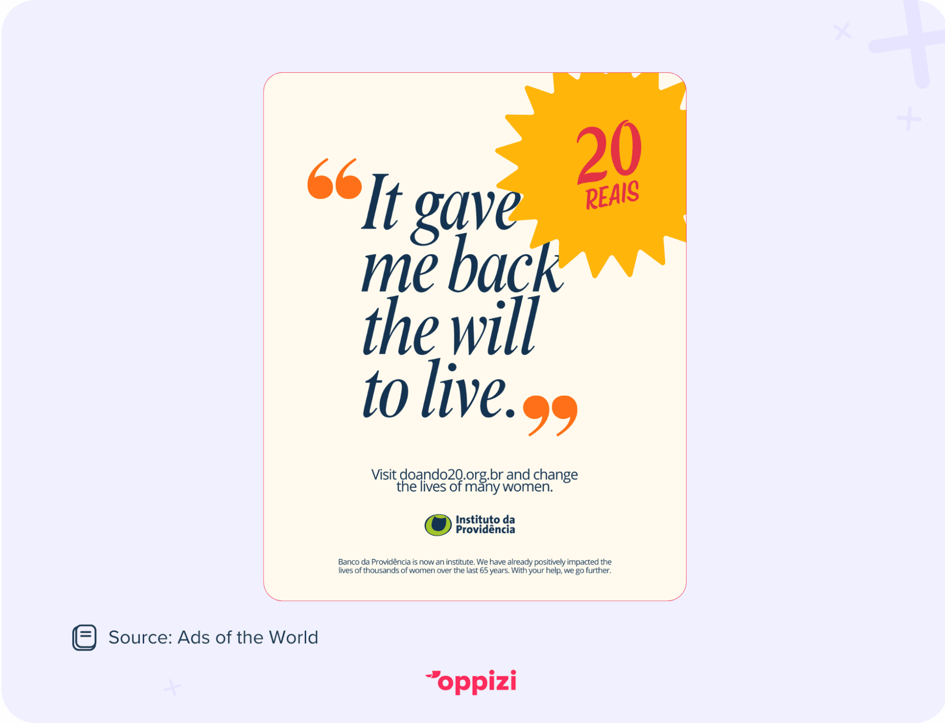
Banco da Providência, a non-profit organization focused on reducing social inequality and promoting human development, took a different approach to using testimonials. Instead of simply adding them to their flyers, they turned real comments from the people they helped into the main text of their ads.
Why it matters
Reviews can increase conversion rates by up to 270%.
8. Use white space
White space means empty areas around text and images. It makes your flyer look clean and helps people focus on what matters. Too much clutter can overwhelm readers.
How to do it:
- Don’t crowd your flyer with too much text or pictures.
- Leave margins and space between sections.
- Group related info with enough space for easy reading.
Example:
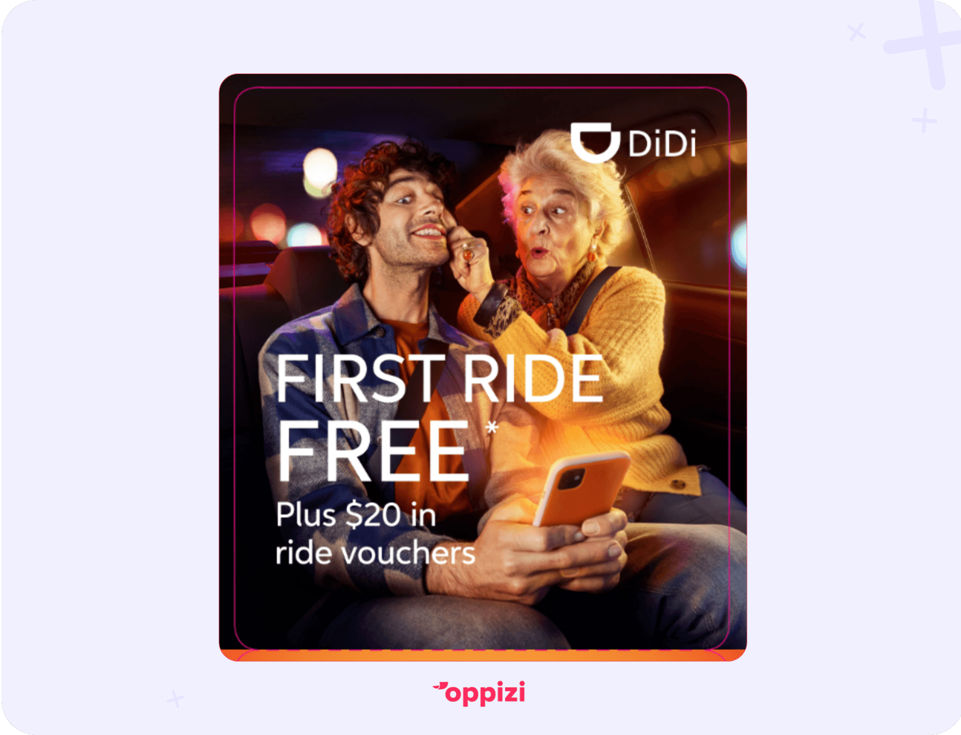
Notice how little text is on this DiDi flyer. There’s plenty of open space, with visuals taking center stage. The goal isn’t just to share information, it’s to grab your attention quickly, create a lasting impression, and avoid overwhelming you with too many words.
Why it matters:
People process visuals 60,000 times faster than text. Clean design helps them understand your message quickly.
9. Offer incentives
Special deals or discounts give people a clear reason to act. Limited-time offers add urgency and can increase responses.
How to do it:
- Include a discount code or free trial/sample.
- Make the offer easy to use with clear instructions.
- Use words that encourage acting now.
Example:
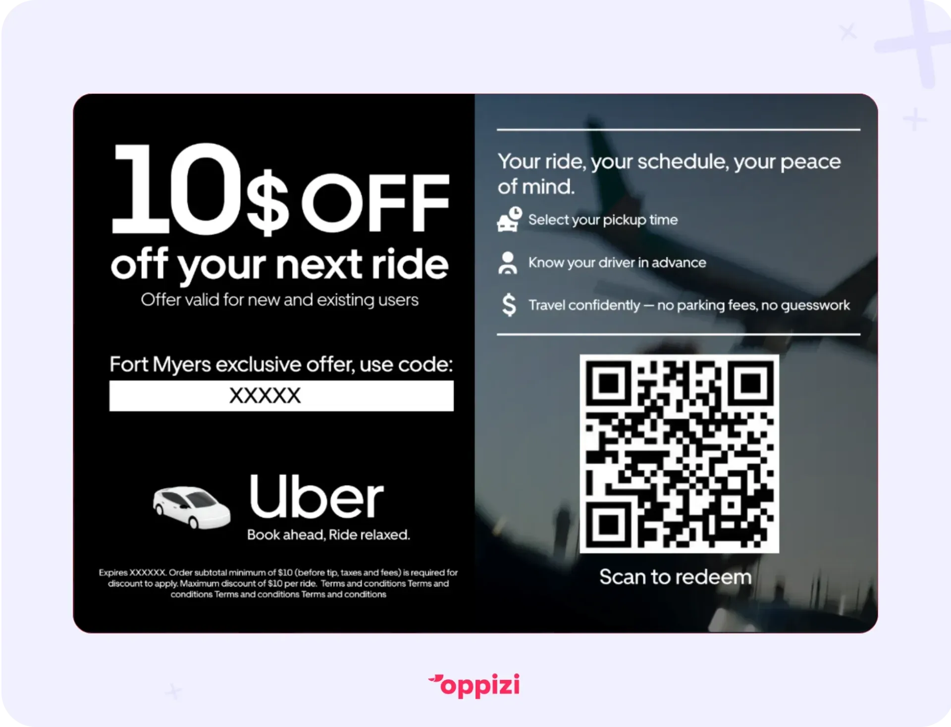
“$10 off your next ride.” Uber’s message is simple, and that’s all it needs to be. Look at the instructions too: they tell you exactly what to do in just a few words. No confusion. No extra fluff. Just clear and concise, exactly what consumers want.
10. Add trackable elements
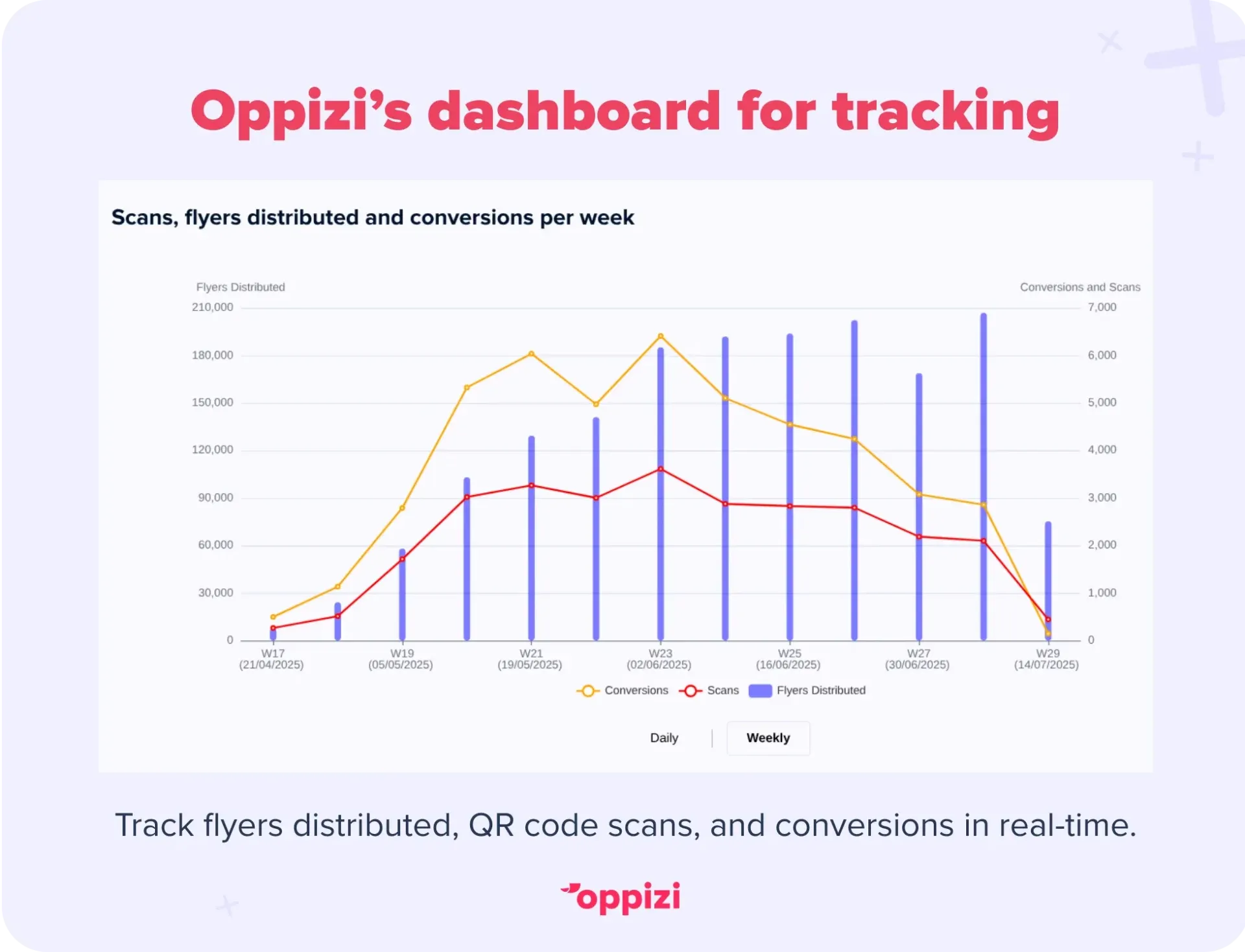
Tracking helps you know what works and improve future flyers. Without it, you won’t know who responded or what worked best.
How to do it:
- Use QR codes linking to your website or offers. Oppizi offers free QR code creation and tracking.
- Include unique discount codes or phone numbers for each flyer.
- Ask customers how they found you (like “Mention this flyer when booking”).
Example:
The Uber flyer above says, “Scan to redeem” and includes a QR code. QR codes are essential on modern flyers, giving consumers a familiar and effortless way to claim their reward. Simply put, there’s no better way to take someone from a flyer to a digital action.
FAQ: Your flyer questions answered
1. How do I choose the right message for my flyer?
Pick one clear idea that matters most to your audience. Think about the main problem you solve or the key benefit you offer. Keep it simple and direct so people get it right away.
2. What type of images work best on flyers?
Use real photos of your product or service whenever you can. Authentic, high-quality images build trust and catch attention better than generic stock pictures. Make sure the visuals match your brand’s style and message.
3. How can I make sure my flyer reaches the right people?
Focus on places where your ideal customers spend time. That might be local events, busy neighborhoods, or partner businesses. Tools like Oppizi’s footfall analysis help find the best spots to boost your flyer’s reach.
4. What’s the best way to track if my flyer campaign works?
Add trackable items like QR codes, unique discount codes, or special phone numbers. This lets you see how many people respond and which parts of your flyer work best.
5. How important is printing quality for my flyer?
Very important. Good printing on quality paper shows professionalism and builds trust. Choose finishes that fit your brand, glossy for bright colors or matte for a more premium feel, to make a great impression.
Conclusion
To make a flyer that really works, focus on clarity, quality, and connection. Your message should be simple and clear. It needs to grab attention in seconds. Pair that with eye-catching, real photos that match your brand and build trust.
Always include a clear call-to-action so people know exactly what to do next. Adding real customer reviews helps boost credibility.
Keep your branding consistent. Use the same colors, fonts, and logo on every flyer to build recognition. Don’t forget print quality. A well-printed flyer shows your business means business.
Use smart, targeted distribution so your flyers reach the right people. And add trackable features like QR codes or special offers to measure success.
Incentives create urgency and give people a reason to act now. Together, these steps turn a flyer from just paper into a powerful tool that drives real results.
Ready to make flyers that get noticed and deliver?
Try Oppizi’s easy flyer builder to create professional flyers in minutes. Then launch a targeted campaign in your city with data-backed tools that help you succeed. Get started.